The following solution was implemented in a real-world scenario using D3JS as a client-side data-handling framework. Shapes were programmed using basic SVG objects.
Problem: You are running a manufacturing process that requires some manual classification by employees. Employees follow a spec containing examples, images, and guidelines on what to look for. However, their classification is not 100% accurate. Knowing their current accuracy is one thing. But what do you do next?
Solution: Map out the mistakes and see what specific mistakes are trending. A mistake can be defined as pairs of data. The first element is the original classification of the employee and the second element is what the “correct answer” is. Visualize each data pair as a percentage of all mistakes.
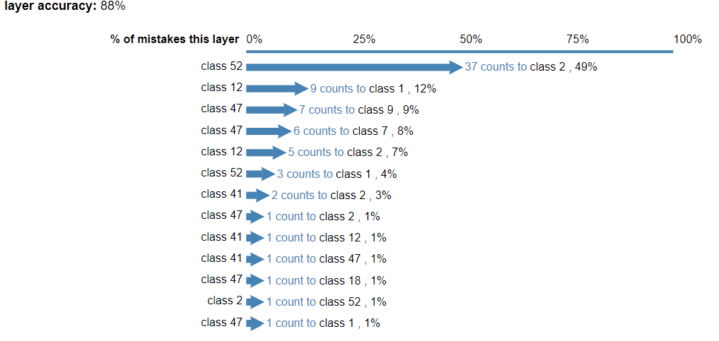
Here we can see that ~50% of all mistakes are employees mistaking class 2 as class 52. There were 37 such mistakes.
Furthermore, we can highlight classes on one side of the chart to gain more insight.

In this image, I moused over “class 47” on the third row, which highlighted all cases where employees thought the defect was class 47. Class 47 is confused with many other classes.
As corrective action, the following can be done:
- Revise specifications to have more information distinguishing class 52 from class 2. Have more training emphasizing the differences between class 52 and class 2.
- Revise specifications of class 47. Have more training on how to look for more unique features of class 47.
